Thứ Tư, 27 tháng 8, 2008

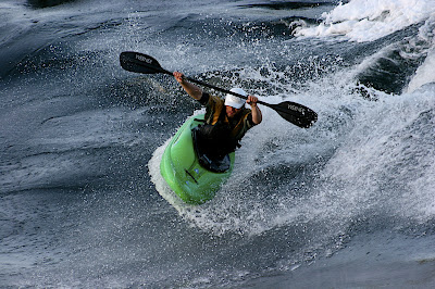
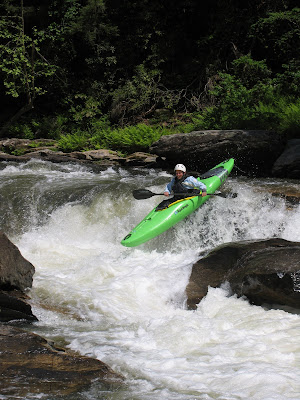
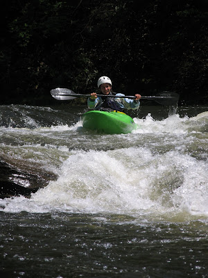
Liquidlogic Biscuit Testing on the Ottawa River


Classic Ottawa Scenery

There is a slideshow to all the photos at the bottom of the post.

It was sooo dry here in the south that I decided to drive up north to paddle in Canada. They had been getting lots of rain and even as recently as a couple weeks ago Buseater was in so we knew we would find something good to paddle. Even at the in between levels that we were looking at on the Ottawa there were plenty of smaller play spots to test on. So it was a good start for checking out the Biscuit protos.


Setting up the new boats

The crew was:
Me: (43) Once I knew how to playboat, a little, but now I am an off the couch playboater.
Yonton: (young punk) He is a fantastic playboater who has made the finals in several world championships, but also a little off the couch.
Justin: (older than Yonton) Justin is more of a river runner but also a good playboater.
Beaz: (old as dirt):) Beaz is my old paddling buddy from travels in the past. His claim to playboating fame is '97 Worlds in an Open Canoe and poster boy for Perception in a Super Sport.
Marlow: (young punk) Marlow, well you all know Marlow. He is one of the top wave paddlers in the world.


CJs House Along the River

We were lucky enough to be able to stay at Camp CJ (Cindy Jamison's) place along the Ottawa river. Its easy paddling distance to the main two runs and super close to Garburator and McCoys. It was perfect. Thanks CJ.


Ed wheeling

Afer driving all day we did stop off at the Black River to paddle at Hole Brothers at a horrible level. Not sure why we did that but hey a day on the water is better than a... We had the whole crew from Hudson River Rafting out in the boats. The wave was slow and not very dynamic but folks were able to do some stuff and it did turn out to be a good testing of how the boat did on smaller, slower features. It showed me that I need to work on the speed a touch more and probably make the ends a bit more slicey but that was about as much info as I could get out of this spot at this level.


Yonton working the blunt

Once we got to the Ottawa the levels weren't perfect but there were several smaller spots that were really fun and our first day on the river was a really fun evening paddle as a storm rolled in over the plains. There was a slow wave hole that was perfect for mellow surfing, spins, and blunts. And a very good little play hole that were getting most hole moves to work. It was here that we really figured out that this thing is very good in a hole. Its super well balanced and likes to be vertical. It was a little shallow for big loops but there were lots of good loops and McNasty type things going on.


Under cool stormy skies

Then we noticed just on the other side of the island from the smaller play hole there was a bigger faster spot that was giving up some blunts and good fast cartwheels.


The sun came out the next day


Justin Wheeling

After the first couple of days testing on the Ottawa we all felt pretty solidly that this thing was great in the hole. We were able to test it in several different types of holes and actually found a couple waves that were a little bigger as well. And our thoughts at the Black were confirmed on the slower waves. "I would like it to be a little faster on smaller slower stuff." What was surprising though was how well it took off on the bigger stuff. On the two bigger waves that we were able to paddle on the Ottawa the Biscuit started to speed up, and it got loose as hell.


Speeding up on the bigger waves


Yonton clean bluntin'

Here is the slideshow to all the photos. There are somewhere around 40 shots of our time on the Ottawa testing the Biscuits. If you have anything you would like to see let me know. Or if you have any questions feel free to ask.

Later
Shane

Thứ Hai, 25 tháng 8, 2008

Criss + Cross: Swiss Design returns to India

Design for India

Image: Criss + Cross: Swiss Design on show at the NID Design Gallery in Ahmedabad. The exhibit opened on Tuesday, 5 August 2008 and stayed on show for public from 6 - 14, August 2008


The Criss + Cross exhibit is traveling in India after having journeyed through a number of other countries since it was first put together in 2003. Criss + Cross has been curated by Ariana Pradal, Köbi Gantenbein & Roland Eberle. The exhibitions in India are part of the jubilee celebrations commemorating 60 years of Indo-Swiss friendship and put together by Pro Helvetia worldwide, the Swiss Arts Council, dedicated to promoting cultural works of nationwide and international interest. Three hundred of the finest Swiss designs assembled by the curatorial team are on display in six “Magic Boxes” under seven themes as follows:
1. small + beautiful: meticulous Swiss precision and things that just work
2. the tiny helpers: ubiquitous products for everyday use but with a difference, the Swiss way.
3. up to the mountains: natural wisdom from the Swiss terrain and the mountains,
4. the longsellers: all time classics
5. hip + young: youthful expression and products for the young at heart.
6. a visual statement: a slide show that presents about 300 recent works of graphic designers from various fields.
7. library: beautifully designed and printed books
The exhibition opens in Bangalore in partnership with the Srishti School of Art, Design and Technology & Goethe-Institut Bangalore. 
The venue: the Goethe-Institut Bangalore, Max Mueller Bhavan
: opening on Friday, 5 September 2008 at 6:30 pm 
Exhibition will be on view from 6 - 20 September 2008, each day from
10:30 am - 6:30 pm (Mon - Sat)
and 10:30 am - 5:00 pm (Sun). Those designers and design students who missed the exhibit at NID, Ahmedabad are strongly advised to catch the earliest flight to Bangalore and make it for the show. If you are already in Bangalore you have no further excuse to miss this very special Swiss treat, all packed in six crates.

Image: Criss + Cross: Swiss Design exhibition was packaged in six cases and organized in seven sections, each in wooden crates with integrated lighting and the seventh, a slide show projection system, The exhibit on the right is the “Library” of fabulous Swiss Graphic design books and on the left is the exhibit called “Small & beautiful” with several of the finest examples of Swiss fine craftsmanship from medical devices, watches to computer accessories.


My personal favorite here in this section is the Kern Compass Set, which reminded me of the much bigger and elaborate professional set that was given to me for personal use when I first joined NID as a young design student in April 1969 and this did help whip up my passion for fine geometry diagrams by using some of the finest drawing instrument in the world! NID knew quality in those days and respected it to ensure that every student used the best of class in the world of drawing devices in their classes and that for me is represented by the Kern drawing instruments that was standard supply for all students joining NID in those days. Circles drawn with the Kern set did not leave gaping holes in the drawing sheets since the compass point is of hardened metal and the tip is adjustable to remain perpendicular and most of all the joints just worked and did not shake or slip due to the fine precision that came from the Swiss workmanship and their understanding of quality and design at the functional as well as the aesthetic level. There were no compromises in their product.

The other remarkable exhibits in this section are the Swiss Passport which can make every citizen proud to hold one that is so distinctive and secure while the other is a commemorative edition of the Swatch which is one of four special designs offered for the 700 th anniversary of Switzerland in 1991. Each exhibit has a story to tell and the Criss + Cross catalogue is a useful resource that can add value to the exhibit, I have one in hand, special thanks are due to the Swiss Embassy in Mumbai which kindly spared a copy for me to review.

Image: Dimple Soni, an NIID faculty and coordinator of Exhibition Design studying the exhibit detailing at the “Little Helpers” container. A finely detailed box, hinged and mounted on roller castors can be opened and mounted in a jiffy, with all the signage, lighting and exhibits in place, all in one simple case, unpretentious and elegant, just great design detailing and treatment. At the top are a row of peepholes that invite the viewer to participate, each shows one colour slide of an object and the solution is a simple 35mm slide picture viewer mounted behind the peephole that uses the glow of the lights in the box to show the slide in sharp view, a simple plastic viewer that gives us great pleasure, that many electronic gadgets would not be able to.


The objects in this section are consumer and domestic products from everyday life, each designed to get the job done with minimum fuss and the objects all but become invisible to the user since they just work and the title “Little Helpers” is an appropriate label for this category of ubiquitous products of our day, all well designed. My personal favorite here is the Omega drawing pins with three legs instead of one central pin, each made by punching thin sheet metal into an embossed and therefore sturdy pin, comfortable for the thumb that could hold drawing sheets to the wooden drawing boards that we all used as students at NID in the heady days of the late 60’s of design learning under the Swiss influence that came through our Graphic Design department. In those days all our graphic design teachers had traveled to the Mecca of Graphic Design in Switzerland, the Basel School, to be tutored by none other than Armin Hofmann and his colleagues to come back and introduce the International Style in India with over 500 or more corporate logos, all designed by the Institute under this strong and durable Swiss influence over the early years of NID and its practice of design in India which I have mentioned in an earlier post on the subject..

Image: Detail of two of the six cases that make up the Swiss Design exhibit. On the left is the “Up to the mountains” crate showing designs produced by the traditional wisdom of a mountain dwelling people rooted in the reality of the land. On the right is the “hip + young” crate with designs for the youthful and playful generation.


Each nation around the world can boast of indigenous design solutions in their food, homes, objects as well as votive occasions and festivals, all designed through local action over the years by ordinary human actions. We too will need to look at what India has to offer as an enormous resource with our huge regional variations and long history of settled civilization. Design at this level is a product of culture and it goes to a very deep level in each refined manifestation, which may take many centuries to mature. The Swiss have learned their lessons from their mountains and these exhibits represent this deep respect for the mountain, particularly one as imposing as the Great Matterhorn, a challenge for climbers of all ages. My favorite in this section is the Avalanche dog, the Grand Saint-Bernard, a Swiss contribution to the world of specially bred and designed nature shown as a small ceramic model since the real one could not be shown. Design with nature is just as Claude Levi Straus tells us that the Mayan civilization created many of our vegetables, which were all “designed” by their careful breeding and imaginative nurture of nature in the past. In the youthful category my favorite is the Classic Micro Skate Scooter now used by adults and children alike to get around town but for me it brought back memories of my own childhood scooter from my fathers factory in Guindy, Madras when I had my very own scooter to zip around the toy factory and the vast grounds that led up to the Mount Road entrance. I will save this from another post that will link up to the Rockytoys story from my childhood days.

Image: “The Longsellers” or Swiss all time classics with many exciting and famous offerings as seen from the pages of the Criss + Cross catalogue.


Seen here are the famous Vitra design miniature pieces, each a precise scaled down model of a design classic produced by this remarkable design led company which also makes the original items in true and faithful detail, as specified by their designers. Max Bill’s Ulmer Stull is seen hanging at the top of the box and below it is the classic Univers font that was designed by Adrian Frutiiger another one of the NID’s great visiting teachers in the roaring 60’s. He was also responsible for the design of the famous NID symbol that is now standing at the main entrance gate as a cast in concrete negative form, which is back-lit at night to be seen from the road. Further on the shelf, is the triangular Swiss delicacy called Toblerone, my favorite chocolate, which is visible from both sides through the cut-out section in the display box. Clockwise, the thumbnail images below show – the section separator in the book, the Univers font by Adrian Frutiger in 1954, the famous Victorinox – Swiss Army Knife revised as ALOX in 1980, The Landi Stuhl by Hans Coray designed in 1938, the Le Corbusier LC1 Armchair from 1928, the Station Clock by Hans Hilfiker in 1955, the Garden Chair by Willy Guhl in 1954, Ulmer Stool by Max Bill in 1954, and Verner Panton chairs by Vitra from 1958 and 1960.

For me personally many these items of furniture along with the ones that we saw frequently featured in Danish and Italian magazines in the NID library formed the impassioned introduction to design as a young student at NID in the late 60’s and early 70’s when these very designers inspired me with their work and their imagination as well as deep understanding of material and form that is represented by their classic design offerings which we now see in the Swiss design exhibit now in India for the first time. The Ulmer Stuhl is for me a very special exhibit since this was one of the remarkable products that was available as a reproduction at NID along with the box-wood filing cabinet that was used by Prof Kumar Vyas and Prof Sudha Nadkarni, both having returned from Ulm exposure in the early 60’s. I was given the filing cabinet to redesign in metal wire as my very first design assignment at NID by Rolf Misol, my German furniture design faculty when I joined NID in April 1969, but that is a story for another day.

Design for India

Thứ Tư, 20 tháng 8, 2008

The Liquidlogic Biscuit: Prototype Number One

So the word is out. The Biscuit Protos are fresh. Marlow Long took a bite out of the first ones out of the oven. Here are some photos and video at Skook.


Fresh Hot Biscuits


Launching an Air Biscuit :)


Cleaning his plate

Click Here for the Video

I finished the second protos for the Outdoor Retail Show and now I finally have a chance to get away from the shop for a bit of testing. Yonton, my old buddy Beaz, and Justin are all headed up to the Ottawa for some fun. The levels are off for the big Ottawa waves but the play should be decent, and word has it that High Tension is coming in soon. So it should be a good test of more normal playspots, and a good wave. I will post more as we go.

Cheers
Shane

Thứ Hai, 18 tháng 8, 2008

Free Machinists CNC Training Videos for PartMaster

Dolphin PartMaster is low cost CNC machinists software for milling, lathe turning and wire EDM which is supported and sold by CADDIT. This web page includes a number of video CAD CAM tutorials from the manufacturer.

Industry CNC machinists, educators and universities alike will now benefit from a completely new manufacturer CNC information website from PartMaster for training. The site includes new videos demonstrating CAD, CAM CNC milling tutorials, lathe, wire EDM and 3D CAM. Full personal online training will also be offered shortly.

The new videos include numerous practical examples of using PartMaster Level 1 2 and 3 software to create Text Engraving, Face Milling , Thread milling, Contouring and more. PartMaster has a variety of applications for tooling, CNC water jet, flame and laser cutting, wood and furniture manufacturing and electronics.

CADDIT continues to support and sell PartMaster at a special price to the Asia Pacific region. For AutoCAD users, CADDIT has also developed a live interface between progeCAD advanced IntelliCAD and PartMaster. Users can select entities to be machined from any AutoCAD DWG or DXF file and choose to import those directly into either PartMaster CAD for further preprocessing or PartMaster CAM mill lathe or EDM. There is also a video tutorial of our progeCAM bundle on YouTube.

Thứ Tư, 13 tháng 8, 2008

I Speak For Canadian Rivers

The following is excerpted from www.ispeakforcanadianrivers.ca:
Transport Canada is in the process of rewriting the Navigable Waters Protection Act (NWPA) to eliminate a developer’s obligation to consider impacts on navigation when building dams, bridges, causeways or other invasive structures on thousands of waterways across Canada.

Transport Canada Minister Lawrence Cannon and his allies in government and industry hope to achieve this by exempting "minor waters" and "minor works" from the NWPA, and by re-defining "navigation" under the act in a way that will strip all legal protection from recreational navigation.

The new law will ignore all whitewater rivers, all seasonal waterways and all vessels with less than a one-metre draft. This is a direct assault on Canada’s tradition of river travel and the future health of our waterways by the same people who are supposed to protect both. It is a fundamental breach of public trust.


For more information, please visit the I Speak For Canadian Rivers website. While there, register and sign the online petition if you agree. Get one of their signs too and display it to show your support. Also, send a letter to your MP to express your concerns and cc the letter to the Minister of Transport, Infrastructure and Communities, the federal and provincial Environment Ministers, and anyone else you can think of.

Spread the word. Contact your local environmental organisations and get them on board. E-mail or write your friends and any contacts you have that you think might get behind this movement.

Paul Mason thinks it's important. Check out his latest cartoon which suggests his thoughts on the matter.

Thứ Hai, 11 tháng 8, 2008

Prestigious Awards and Design success: The Onio example

...Design for India...


Image: Hispital Bed designed by Onio Design, Pune for their client Godrej Interio and it won an award at the Design Brilliance Award


A press release from Onio Design tells us that they have won a prestigious award for their new Hospital Bed Design. Congratulations to Manoj Kotari and Prakash Khansode for this achievement and this is extended to the teams involved as well. According to the release the award has been instituted by Future-Group, Business World and National Institute of Design jointly. You can see the full report at this link here:

Hospital beds have been in the cone of vision of designers who have tried to show that design can work in critical areas and not just in the market economy. Prof Bruce Archer carried out some of his most intensive research efforts on the design of a Hospital Bed at a time when very few believed that design could be a systematic activity. Read more about this at the wiki link below: Bruce Archer and Design Research at the RCA

The interest in Hospital beds and the recognition that the healthcare industry needs design brought the Metropolis Magazine to ask four design groups to offer what they called "Design Prescription: The Hospital Bed: Reimagining the bane of every patient’s existence." The results of the 2005 initiative can be seen as concept designs in the slide show that pops up by clicking on the image of the traditional bed on the page. See the Metropolis link here:

I was project guide to NID student Pradeep Shodhan way back in 1976 when he designed a Hospital Bed as part of his diploma project at the National Institute of Design and this problem that was addressed then has not gone away and I am happy to see the Onio initiative offering an alternative for the Indian market. The diploma document can be seen at the NID library but it did not reach market although it was fully developed and ready to go. In those days industry was not looking at innovations to drive the market since it was the license and control Raj that was in operation in India. Specifications was king and innovation took a back seat. I wish that NID would make these archival documents available online as digital files which is so easy nowadays.

Recently Seymor Powel designed an improved aesthetic bed for Huntleigh Healthcare which has function and form at the heart of the offering. Created as a range to meet a variety of critical needs these beds use metal and blow moulded components to achieve a more humane look and feel for patients in high performance healthcare situations. The company claims that besides meeting the needs of patients the needs of maintanance engineers, porters, cleaning staff and all direct users such as doctors and nurses were also met through deep research. See the Seymor Powell bed here:

The Onio bed for Godrej looks smart and works well in an economical and ergonomic manner, congratulations team. I wish it commercial success. The bed was designed for their clients Godrej Interio, a furniture manufacturing unit of Godrej Group of companies that has been a leader in the furniture industry in India.

Image: Snapshots of the Onio website showing unconventional design offerings.


This Onio offering can be a role model for drawing much needed investments into design for non luxury products much needed in India today. The Businessworld Awards in India and most other international design awards each year are filled with examples of luxury products where industry has been using design to push and grow the market just as fashion product manufacturers have tended to look to design to keep the wheels of their industry moving each year through new and enticing offerings that can attract a consumer in a very crowded marketplace. I hope this particular demonstration from Onio opens a new trend for India and we would see many more of these design offerings with the much required investments in sectors of real need such as public utilities, BOP products as well as other sectors of real need from both industry as well as the Government in the years ahead. See BusinessWorld Awards here:

Victor Papanek had called for an awareness of real world issues in his book titled “Design for the Real World” in the early 70’s and and much later in the mid 90’s he called for a concerted effort from designers to address environmental and ecological issues in his book “The Green Imperative”. Papanek visited NID in 1979 to attend the UNIDO-ICSID conference and I remember that the students were drawn to his ideas like flies to some sweets but the conference organisers found his views too radical to be brought centre stage at the ICSID and UNIDO agenda although this did happen much later. The Design for Development conference in 1979 gave me the opportunity to design a new auditorium chair for the NID and twenty years later this set the stage for the design of another new chair for the Ravi J Matthai Auditorium at the Indian Institute of Management in Ahmedabad which I have written about in my previous post on the Design for India blog.

Design for India

Something else new from Liquidlogic


Now that we have had a kids boat for a while and I have paddled with my brother and his kids a bit we started to realize that there aren't many good whitewater paddles made for kids. So we've jumped in. We have started development of a kids whitewater paddle. A few things that I have seen that are really important for a kids paddle and haven't really been addressed are making a kids paddle that is light enough, the shaft is small enough, and is a nice performance paddle so that kids can get the same feeling from a paddle that you or I have. Most importantly though it seems to me like we should put some cool graphics on it. What do you think?

Chủ Nhật, 10 tháng 8, 2008

The Remix XP not your normal kayak.

So if you have checked out the blog some you have seen that i like to do fun overnight trips with friends and family. The one I do fairly regularly is on the Chattooga river. Usually we just do two days and one night trip over about 16 miles. Ok so my point is we have now come out with a boat just for it.

The Remix XP


Woody is in love!

There are two sizes. A ten footer and a nine footer. The whole idea was to make a boat that folks can paddle whitewater well, but also work on the flats. It has a drop down skeg that makes the XP track super straight, and then you can flip it up out of the water and she then handles like a big whitewater boat. It also has a large storage hatch in the back and we are working on custom dry bags to pack her perfectly for overnighting. You can even get cup holders for this thing in the 24 and 12 oz. sizes.


The Drop Skeg


The 24 oz cup holder and spring loaded skeg lever! Yeah Baby

Here are a few shots from the Chattooga


The Show goes on Day 2
So if you are out there in your creek boat doing overnight stuff its like going backpacking but going out in the Remix XP is like car camping you can bring it all.
Woody and I tested her out a bunch on the Chattooga. Section 4 was never easier. Paddle the river and then flip down the skeg and cruise the lake. Awesome.
Shane

Thứ Bảy, 9 tháng 8, 2008

IIMA Auditorium Chair: A tale of three chairs for India

Design for India


Image: Thumbnail images of the auditorium and the chairs designed by me for the Ravi J Matthai Auditorium at the Indian Institute of Management, Ahmedabad and these were taken in December 1999 during an event organized by Sam Pitroda, soon after the auditorium was commissioned.


The School of Interior Design, CEPT University, Ahmedabad (SID) has announced its third conference in the “Interior Design Traditions in India” series to be held in the Ravi J Matthai Auditorium (RJM) at the Indian Institute of Management, Ahmedabad (IIMA). This gives me an opportunity to reflect on the auditorium chair design for the RJM Auditorium since I was personally involved in the design of the tandem seating system that is used at this venue. I am quoting below the call for the conference and the participants will get to use my chairs during the conference and it gives me the opportunity to get feedback from our peers. Last year I was invited to speak at the SID conference that explored the Post-Independence Era in India and my presentation titled “Bamboo and Design: NID Initiatives” can be downloaded in three parts from these links here as pdf files:
SID2007_Bamboo_Design_01 (size 10.1 mb)
SID2007_Bamboo_Design_02 (size 8.1 mb)
SID2007_Bamboo_Design_03 (size 15.5 mb)

Now back to the Ravi J Matthai Chair, sorry :-), the Auditorium Chair for the RJM Auditorium at the IIMA, The story goes a long way back since in 1978 I had designed the NID Auditorium Chair to be used for the UNIDO-ICSID Conference on Design for Development. This was a real crash assignment and a crisis management effort due to the very limited time that we had to carry it out. The organisers of the conference at NID had somehow forgotten to design a chair although a new Auditorium was already under construction in late 1978 when I was brought into the picture with barely a month remaining. I was already involved in the conference efforts in another capacity in the background research and the case studies that were being assembled from the NID faculty and student experiences.

In the last week of November 1978 Prof Kumar Vyas and Prof. Dashrat Patel summoned me to the venue on the NID Second Floor and asked me if I would take up the assignment of designing a new chair for the NID Auditorium to be ready for the UNIDO-ICSID conference on the 14th January 1979! We had just 45 days to conceive, design, refine, build and deliver 200 plus chairs for the NID event. I used the NID Old Auditorium Chair as a model for my own offering and the base of the chairs are made in the same manner while the upper structure is new and uses canvas for the seat and the back. This project was being offered to me because I had completed another very time critical assignment in the late 80’s for the International Airport Authority of India (IAAI) when we had designed and then fabricated 400 tandem seating system chairs which is another long story. Here the metal tube based base structure was designed by me while the FRP chair shell used was that of Charles Eames and was being offered by a firm in Madras at a very good quality and price.

Gajanan Upadhaya, a faculty colleague and an ace furniture designer at NID who was designing the new staircase that would lead up to the auditorium wisely refused the assignment and it came down to me for my consideration and sleepless action. I took up the assignment under duress and on 14th January 1979 the conference opened in that auditorium and the rest is history. The chairs designed then are still in use at the NID. Dhimant Panchal who was then a student in Product Design assisted me on the task and J A Panchal was the Head of NID Workshops and he had the task of fabricating the chairs in time for the opening. The key contributor in the fabrication was the master craftsman Chaturbhai who was the then supervisor of the NID Metal Workshop and he played a major role in the jigs and fixtures that were developed to fabricate the chairs at NID as well as in the shop floor coordination and quality control in the fabrication processes. I will get back to the story of the NID Auditorium Chair in a later post but this project had laid the seeds for the IIMA assignment.

Image: The Ravi J Matthai auditorium at IIMA from the outside and the inside during an event in 1999.


In 1998 or thereabouts, Prof Pradeep Khandwalla, the then Director of the IIMA came to NID to meet Vikas Satwalekar the then Executive Director of NID and asked to see me since he was interested in getting a similar chair for the IIMA auditorium that was being designed by architect Anant Raje keeping in mind the fine traditions of the Louis I Kahn buildings on the IIMA campus. The NID had been appointed the architectural consultants to the IIMA way back in 1962 and it was NID who brought in the architect Louis I Kahn to provide the conceptual leadership for the project. I was fortunate to meet Khan personally on his last visit to Ahmedabad and listen to his lecture at NID in 1969. The IIMA buildings were icons that all of us looked up to and the opportunity of designing a chair for the extension auditorium on the campus was a real privilege for any designer.

I accepted the assignment and with a student assistant, Shambhavi Kaul from the Furniture Design faculty, worked on the refinements on the earlier NID chair to solve several problems of mounting canvas seats that would ease maintenance issues that we faced at NID. We developed a threaded tensioning detail that was the basis of the IIMA chair and a modified mounting detail that could connect the tandem seats to the concrete floors and steps at the Anant Raje designed auditorium. Master craftsman Chaturbhai who had by then retired from service at NID and started working with a metal furniture fabricator in Ahmedabad made the prototypes. However their company did not get the final contract since it was given to a lower bid from Anukool Furniture Pvt Ltd who completed the task under our supervision.

Now that I have started writing about the chairs and the processes that contributed to its making hundreds of facts and insights rush back to my mind and the text seems to keep growing too long. I will save the details for later and await feedback from the visitors to the RJM auditorium for the SID conference later this month. Details of the conference are quoted below. Unfortunately they do not have a website so the full quote is given below:

Seminar series on INTERIOR DESIGN TRADITIONS in INDIA

Theme and Intent
Interior environments are a direct reflection of life and time. Today’s fast changing and globalising world has brought in extensive exposure to thoughts, ideas and objects of consumption. India holds a unique position of being in the dual worlds of tradition and modernity and the cultural mooring of its people demands very context specific responses that take care of both. To resist from being swept away by such extensive inputs and to find an appropriate direction to education and practice of interior design within the Indian context, it becomes necessary to understand how this change has occurred and is occurring.

Bringing together educators, scholars, subject specialists, practitioners and students, the seminar series allows to purview at one time many different perspectives and concerns related to the field of interior design, its evolution and possible future.

With the first two seminars focussing on the interior design traditions in India from pre-independence to pre-liberalisation period, the seminar series has already been successful in initiating the process of increasing the awareness in the country of interior design in India from a historic perspective leading up to the contemporary times. It has also helped create a platform to bring together the divergent experiences of the professional through presentations, documentation and exhibition and promote lively discussions.

The third and the last seminar in this series will focus on interior design in the period post liberalisation and in conjunction with the earlier two seminars, would position us suitably to identify the constants and variables in the development of interior design in India across time, ascertain the anchor that holds it all together and make visible that connecting thread which weaves through the exciting tradition of interior design in India.

INTERIOR DESIGN • POST LIBERALISATION
The time from 1991 onwards has been undoubtedly one of the most important for India . The liberalisation of the Indian economy paved the way for India to participate in the globalisation process in-turn allowing globalisation to influence all aspects and spheres of life directly and indirectly. Interior Design too has been much influenced by this shift with the effects of on-going liberalisation constantly changing the way lives are lived and the spaces created for it.

The seminar will attempt to understand the impact that new thoughts, functions, products, technology and materials made and are still making in design thinking and the creation of interior spaces for people amidst shifting identities, cultures, values, design sensibilities, economic parities, social systems, geographies and demography.

Through this seminar, the issues we hope to discuss include
• Prime concerns, influences and inspirations in profession and how they have changed over the last 17 years
• Relevance and impact of interior spaces created in this period
• Interior design for the new functions that emerged and sectors that gained importance in the liberated economy including hospitality, retail, entertainment, IT and allied services
• Interdependence of discipline with allied industries from the manufacturing sector
• Role of crafts in interior design
• Adaptive re-use and interior design
• Sustainability and environmental issues within the scope of interior design
• Influence of new tools and techniques in visualisation, design and execution
• Interdisciplinary influences - attitudes and approaches
• Firm growth of the profession, establishment of formal education and rise of premier institutes
• Forecasting the major challenges and barriers of the near future

The seminar will provide a conducive environment and platform to share thoughts, discuss approaches, initiate rich interaction and exchange amongst all stakeholders that will help make sense of the many important
issues that play a determining role in interior design of the present day and the future we hope to create.

SPEAKERS AND PARTICIPANTS
Speakers of national and international repute have been invited to present their views on this theme. Apart from the faculties and students from the host institute, this seminar invites the heads, faculty and students of interior design and other related disciplines, interior designers and other professionals connected to the discipline and practice of interior design from all over India.
Aman Nath, Neemrana Group of Hotels, New Delhi
Amit Pasricha, Photographer, New Delhi
Bijoy Ramachandran, Hundredhands, Bangalore
Canna Patel, HCPIA, Ahmedabad
Dean D’Cruz, Mozaic, Goa
Jacob Mathew, Idiom Design and Consulting, Bangalore
Kishore Singh, Senior Editor, Business Standard (to be confirmed)
Lata and Jaigopal Rao, Inspire, Cochin
Latika Khosla, FreedomTree Design, Mumbai
Nitin Kilawala, Group7 Architects, Mumbai
Pronit Nath, Urban Studio, Mumbai
Ranjit Makkuni, Sacred World Foundation, San Francisco (to be confirmed)
Ratan J Batliboi, RJB-X, Mumbai
Ravi Sarangan, Edifice Architects,Mumbai
Sameep Padora, sP+a, Mumbai
Samira Rathod, Samira Rathod Design Associates, Mumbai
Shilpa and Pinkish Shah, S+PS Architects, Mumbai
Stephane Paumier, SPA Design, New Delhi
Uday A Athavankar, IDC, IIT Mumbai

Two sessions will also have the alumni of SID presenting their explorations in the world of design.

Seminar Convenors
Nimish Patel and Parul Zaveri, Abhikram, Ahmedabad

SEMINAR SCHEDULE:
The seminar will span 3 days with four sessions on each day starting at 10:00am and will go on till 6:00pm with tea and lunch breaks in between and dinner on Day01. Each session would last for 90mins with two speakers in each session and enough time for discussions.

REGISTRATION DETAILS:
Registration will take place at the venue on the first day from 9:00am onwards. As seats are limited, prior intimation/pre-registration by e-mail would be highly appreciated.

The registration charges are as follows:
Professional/Faculty: Rs.1000
Students: Rs.450

For more information, contact:
anand ramakrishnan . +91 97247 12537
kamalika bose . +91 99098 96482
seminar co-ordinators
SID Research Cell, CEPT University
Kasturbhai Lalbhai Campus, University Road
Navrangpura, Ahmedabad 380 009 INDIA
T : +91 (79) 2630 2470, 2630 2740 (Extn.181), 2630 6652
F : +91 (79) 2630 2075
E : research.sid (at) gmail.com

Design for India

The New stuff from Liquidlogic

Its show time ya'll! Almost as many kayaks in one place as Gauleyfest and a lot more people milling around kicking the tires on all the new stuff out here in Salt Lake City Utah.


First things first we haven't had a new playboat in a few years and I have started developing a new one for next year. Its called the Biscuit for several reasons. For one reason my dogs are named Biscuit and Tater I think some of you know them. Biscuit is, shall I say, high energy, and full of spring.


Another reason for the name is of course one of the favorite foods of the south, your down home basic butter biscuit. Delicious, light, fluffy and starting in Febuary they will be made fresh from scratch daily. And finally I just like the word, Biscuit, it just says goodness to me.


The Biscuit will come in three sizes, and all the stats are still prototype stats but right now we are looking at 6'3", 6'1", and 5'11" in lengths. 26, 25, and 24" in width. The volumes are close to 45, 55, and 65 gallons.


The design criteria is fairly simple and I have some time to work on it. The first round of testing went really well, in fact better than ever on the first try. There are still things I want to improve on but so far so good.


The thing is fast for the lengths, loose as hell, big pop off the wave, and lots of volume for loops, and its comfy, yeah I know a little much, but I am psyched so far there are some things that I will be working on to improve but i have time to get it exactly right.


I started the first proto earlier this year and spent a bunch of time paddling it out in Colorado. Marlow Long has been out paddling it all over Canada on the big stuff including lots of time out on the Buseater wave, and he also took it over to Skookumchuck, and we send a boat over to the UK as well for young master Piers Bucknell has been ripping it up as well. There isn't a ton of photos and videos yet but that will be on the way. Here are a few shots from the show and from the road there will be much more to follow.


The Outdoor Retail show is going really well except for the fact that theres lots of cool stuff to look at its pretty tough on the legs and throat to stand and talk kayaking for 6 days straight. Hope to see you all out there.
Shane

Thứ Năm, 7 tháng 8, 2008

Join the club!

A photo from Montrose Beach on a calmer day. We weren't able to take any photos during the surf session.

Last Saturday, Tom Bamonte, the overachieving president of CASKA (Chicago Area Sea Kayakers Association), organized a club teach-in at Rainbow Beach on Chicago's South Side. Five instructors and about a dozen students showed up at 7 a.m., open to whatever the day might bring.
As it turns out, the day brought wind and waves--impressive ones. Two- to four-footers, depending on whether you partially hid in the lee of a breakwater or took your chances exposed to the full fetch of the lake. Either way, it was a day to learn to surf, to practice landing under control, and to try out rescues and rolls in "conditions" (i.e. waves).
Something we learned the hard way a few years ago: Don't let anybody on the water in surf conditions without a traffic pattern. Since we were dealing with less experienced paddlers, we also reviewed the rules of padding in surf: Anyone on a wave has the right-of-way, anyone down-wave has right-of-way over anyone further out, and if you're on a collision course, flip!
Out we went. The first thing we discovered was that we had two groups: those ready to brave the waves, and those who were terrified. Alec and Jim Tibensky took the braver souls; Tom Hieneman, Tom Bamonte and Sharon took on the sensible ones.
What fascinated me (Sharon) was watching the beginners discover that they didn't know how to brace after all. Sure, they had slapped the water with the backs of their paddles in various classes, but they had never truly needed a low brace, and now that they did, it didn't work. Over they went. Over and over. We quickly ducked behind the breakwater for a refresher course on bracing.
To me, this illustrates the limitations of learning and practicing braces and support strokes on calm water. It's like a fire drill--useful for rehearsing, but a pale approximation of the clearheadedness and technique you'll need for the real thing. An hour or so in the surf proved more productive than days in class, and far more tiring. By 11 a.m., everyone was exhausted.
The other group headed out to practice rescues beyond the surf zone. Again, these are skills we nearly always teach in calm waters, reassuring students that they work well in conditions, too. In wind and waves, students discover why it's so essential to maintain contact with the boat and paddler, and why excess gear on the deck is undesirable. All the students succeeded in their rescues, but they got some real-world experience in why it's important to pay attention to the details when executing rescues. (As Leon Somme, says, "Perfect practice makes perfect." Or at least, that's what we think he says!)
Joining CASKA costs $12.50 a year. For that, you get discounts at local paddle shops that quickly surpass the cost of membership. You also get friends to paddle with, the wisdom of the crowd, and sometimes, four hours of free instruction.
If you're a Chicago-area paddler, consider this your invitation to join CASKA. If you're elsewhere, check out your local club. There's no better deal in town.

Thứ Tư, 6 tháng 8, 2008

Sorry about the blog withdrawl!

Medieval torture? No, just some wrist gaskets being glued into place.

OK, we've heard from enough people that we feel guilty. Yes, we've been too busy to blog lately. Yes, we've been on the water. Tomorrow for sure....we promise!

Thứ Ba, 5 tháng 8, 2008

VariCAD 2008 3.0 3D Mechanical Design CAD Released

The cross-platform Windows-Linux CAD for 3D mechanical design has released 2008 version 3.0. VariCAD is ideal for machine, jig, fixture and small project design.

New Features Include:
- Implementation of Unicode. The new version supports using fonts from anotherlanguages (e.g. Japanese, Chinese, Russian etc.) and special characters.
- Improved DWG/DXF file compatibility
- More convenient system settings
- Improvements in BOM
- and more

VariCAD can be downloaded an used free for 30 days before buying a license HERE. Please contact CADDIT with questions regarding this CAD program.

Chủ Nhật, 3 tháng 8, 2008

Data Visualisation: Challenges in India


Image: Explorations to understand different types of data visualisations. Classification and Categorisation of data representation types using a bar chart metaphor.


The paper quoted below was prepared in response to an invitiaton from an Indian architectural magazine for commentaries on digital design and their impact in the classrooms at NID. This invitation gave us the opportunity to reflect and share the assignments and approaches that we had developed into a course for Information Design students at NID, first at the Paldi campus and later at the new campus at Gandhinagar for the students of New Media Design (NMD), Software User Interaction Design(SUID) and Information and Digital Design (IDD). Two of these disciplines do not exist now since the Institute has decided to relocate these courses to the newer campus in Bangalore and in the process the normanclature too has undergone a change. The new discipline is now called Information & Interface Design (IID). Bangalore campus also hosts two other disciplines since the last year called Design for Digital Experience (DDE) and Design for Retail Experience (DRE).

This course is discussed at a blog site that was set up by the teachers to be used by faculty and students and it is called Visible Information India. Just like the other blog that is used to document our courses in a contemporaneous manner, the Design Concepts and Concerns, this one too is used to report the class explorations as they happen during the semester. The course in Data Visualisation is inspired by the books and work of Edward Tufee and Richard Saul Wurman and it draws on the work of many web based initiatives that have followed the lead provided by these thought leaders.


Image: Classification and Categorisation of data representation types using a cityscape as metaphor.


Data Visualisation: Exploring Emerging Challenges and Opportinities in India
(Published in the architectural design magazine the “Indian Architect & Builder” in 2007.)

M P Ranjan & Rupesh Vyas
National Institute of Design
Ahmedabad

The Context and Intention
The area of visualization of data is growing in importance day by day. This phenomenon is impacted with the increasing use of networked data sources and a massive growth in the channels for communication available to all professions. This massive dissemination as well as the growth in bandwidth and increased computing resources being available at the user end terminals is driving growth for such visual representations of data for various useful purposes of planning and decision making. Here the demand for such representations is coming from both the print media and the broadcast media and strategies are ready to explode in the Internet applications as well. We can see the coming of age of the second-generation Internet products which will offered as a result of demand for such representations and due to their affordability. Keeping these emerging opportunities in mind a team of teachers at NID decided to develop and offer a course in Data Visualisation which could address these emerging needs and develop a framework for imparting the knowledge and skills needed to plan, conceive and execute such visual representations across many domains of application. These would include financial data, statistical data, demographic data, remote sensing data

The areas of application will eventually cover all fields of human activity from medical images to scientific data analysis tools and in financial markets that have to support exploding data streams that are difficult to keep track of using traditional modeling and analysis tools. The human mind and our sensory mechanisms are far too overloaded by the bombardment of these data streams that we are compelled to look for new and improved ways to “See the Data” rather than just look at numbers. While plenty of data is now available through real time systems from widespread automated monitoring, making sense of this data is becoming increasingly difficult due to human limitations of perception, cognition and response action.

The fields of application extend from playful ones in the area of game design as well as to life critical applications such a monitoring traffic flows in the sky and trend mapping in financial and medical situations, and the need to make sense of what we can now see and record with our available and emerging technologies. Geographic data from satellites, surveillance data from security cameras, medical data from pathology labs, home monitoring devices and investment needs of individuals through home banking all provide opportunities for new levels of visualization given the tools available to all of us. The media too has its needs for professional data managers and visualisers in mapping and modeling expressive action sequences to make current events both interesting and comprehensible to both experts and public alike. Decision makers will look for coherent presentations with visualisations of management and planning strategies and time-line models in new and complex business settings where an investment decision can make or break a company. Maps, charts, diagrams, models, statistical graphs, are all examples of visualization types that we are familiar with in today’s media and representation systems. We are entering a new area of dynamic data displays with advanced animation and representation systems that will make the reception and delivery of data several notches up the value chain and those who do it well will be at a premium position in the competitive market place of tomorrow.

This course was invented four years ago in response to these anticipated needs of the emerging marketplace and a number of experimental assignments were devised to bring both the students and the teachers up to date about the whole area of data visualization and its emerging opportunities. The course was divided into a series of interlocking and sequential assignments in a group and individual mode to make it truly inter-disciplinary and multi-disciplinary in approach and delivery. A few of the topics and assignments are described:


Image: Classification and Categorisation of data representation types using a matrix model.


Data Categorisation and Modeling
Data Categorization was the task that the whole group was plunged into from the very first day of engagement. The discussions on the taxonomy of data and data visualization were followed up by a quick assignment of collection of interesting and significant examples of data visualization from the various graphics and scientific books in the NID library. Student teams were encouraged to search and supplement images and diagrams, maps and models from Internet based sources as well. Each of the groups was to try and organize the total data collected into a meaningful structure through a process of classification that would follow intuitive categories that made sense to each group respectively. They could coin terms if required and if required leave an empty slot for a missing image type that they predicted or knew existed, but did not have a prototype in hand for the assignment. They were then expected to build a composite model of their classification showing the similarities and differences between that data types that they had discovered and in this assignment they were asked to assign attributes and categories apriori and through a process of brain-storming and debate, and not to follow any one authority to justify their choices and classification.


Image: Field and library research to visual model. Gandhi Ashram in Ahmedabad as a case study.


Image: Understanding dynamic data using visual representations and models. Mitakhali roundabout in Ahmedabad.


Data Capture: Field to Models
Representing live data from the field was the topic of the next exploration. The students were required to explore different contexts and to conduct field work and visit sites to start capturing data from the field using many techniques of observation and recording. Different milieus and the locations selected included, A shopping mall in Ahmedabad, the major traffic turnabout of six roads in Ahmedabad and the Sabarmati Gandhi Ashram for Tourists and International visitors. The models were developed to suit anticipated future needs as well as match the data captured in the field from observations and recordings.


Image: Modelling village aspirations and development opportunities for use by local population as well as planners. Village Sahpur study proposal.


Last year we gave our students the task if selecting three small villages near the Gandhinagar campus and they were to visit the village, meet the people and try and understand their needs, aspirations and resources through direct field contact. The idea was to give them an advanced assignment in data visualisation which was complex and wicked in its form as well as structure. Based on their field research the team was required to visualise the information that was generated in a collaborative mode in one image map that could be used by the local people as well as the village administration for development oriented activities.
 This is village Shahpur on the banks of the Sabarmati River near Gandhinagar in Gujarat. The village was one of three that the teachers selected by looking at Google Earth and the selection was made based on both proximity to our Gandhinagar campus.

This kind of design assignment gives us many insights that could be used to solve real issues of information management on a massive scale in India which has to deal with real needs of as many as 6,50,000 villages that dot our landscape and not just the cities that are taking up all our attention today. This project was done with the students and teachers using the inspiration offered by Christopher Alexander in his great thesis, "Notes on the Synthesis of Form."


Image: BusinessWeek data on Indo-China industrial competitiveness as reinterpreted by different students. Each used their own point of focus and through contextual research arrived at a unique representation in the process of sense making.


Dynamic Data Visualisation from Statistical sources:
Numerous sources of stastical data provide us an opportunity to explore visual representation across many fields such as sport, economics, weather, transportation, communication and others. Students were requested to use the UNESCO data that is available from their “Institute of Statistics” data centre at their website link and examine and analyse the data from one selected predefined table for a hypothetical decision or design action. Similarly a report from the BusinessWeek on economic parameters of industry in India and China was taken up as an individual task and here the same data was showcased in different styles and intentions by the students which revealed the possibility of variety in interpretation and representation in design. This is critical in design differentiation when competing agencies are showing the same data using different editorial policies which is the case in the real world.

About the authors:
Prof M P Ranjan and Rupesh Vyas are members of the faculty at National Institute of Design, Ahmedabad and Gandhinagar.

M.P. Ranjan
M. P. Ranjan is a senior member of the faculty of the National Institute of Design (NID), Ahmedabad, India and Chair of the Task Force on GeoVisualization set up by the Government of India. Ranjan is highly respected in the design community as a person who has unique insights about wide range of opportunities and responsibilities that lay before designers. He has deep knowledge of design applications in high tech sector, at the same time he has pursued projects to explore potential of bamboo, and other appropriate materials. Ranjan continually explores cultural, ethical, technological, and social issues that pose intellectual challenges for the design community.
web: www.ranjanmp.in
blog: www.design-for-india.blogspot.com

Rupesh Vyas
Rupesh Vyas has ten years of experience in Communication Design education and professional projects. Before joining NID he was teaching at Faculty of Visual Communication, M. S. University of Baroda. He is post graduate in Visualization from the same University.

He has contributed significantly to some of the major consultancy project having National importance. He is taking a lead role in developing Information and Digital Design as emerging discipline at NID. He has represented NID in different national and international forums like ICOGRADA, in Japan and in Expert Forum of traffic guiding systems by International Institute for Information Design (IIID), Vienna, Austria. 
He has special interest in developing innovative ways of information, interactions and interfaces in Public spaces, Location Based Information systems and Dynamic Data Visualization.
web: www.nid.edu