Oh yes, it’s that time again when the red carpet gets deployed. There is frenzy in the Revit community; twitter goes into hyper drive & the bloggers go mad (including me), as Autodesk serve up the latest greatest version of Revit for us to use & abuse on our BIM projects. But before we get into the juicy bits, let’s pause for a second & review some Revit history. Revit 1.0 was released on the 5th of April 2000, so Revit has now been gracing our earth for 13 years. Maybe not as long as that other BIM app which begins with “A”. But Revit has developed into a mature solution which will deliver model based design & can be centroid to the BIM process, but it’s not BIM per say. Some will argue that ArchiCAD is better, Revit is better, blah, blah, I’ve heard it all before. It’s actually a really boring discussion now, what is more important is whether the tools can truly talk to one another, are open & interoperable. ArchiCAD community says Revit sucks at IFC; the Revit community says who gives a stuff when it has the majority of the market share. Passionate users of both camps spend hours defending their beloved solutions on social media like it’s some sort of life or death affair. The reality is that as governments start to push the whole IFC / COBie delivery requirement, all AEC solutions need to start to respect the need for data to be sharable & of an open nature. That is compounded by the recent IFC4 announcement.

In those early years, Revit went through a rapid release cycle, even after Autodesk purchased Revit in 2002 there were a vigorous number of point releases until things settled & Revit then went to a yearly release, which is what we now have. But what I would say is where once BIM managers wanted to roll the latest version of Revit out to their staff on projects, they are now taking a more pragmatic approach to deployment & often holding back for 12 months or even skipping a release. There are many reasons this might be happening. Cost of update training? Cost of deployment? Long term projects which have decided to keep with a consistent version? Anyhow, it seems to be more common place.
What’s new?
Revit 2014, what’s new? What’s been improved? So these are the highlights, but like any release of Revit you will find minor tweaks here & there, some which get documented, others that don’t, so be on the look out! I have reviewed the architectural & general platform enhancements, however I have also listed the structural & MEP improvements, but do not go into detail in this review.
- Displaced Views
- Dockable Windows Framework & Enhancements
- Material UI overhaul
- Non rectangular crop regions
- Room calculation Point
- Schedules
- Selection enhancements
- Split Elevations
- Temporary View Templates
- View navigation performance
- Multi Selection - bring to front & send to back
- Stairs & Railings
- Double click to edit
- Point Clouds
The specific structural improvements include:-
- Multi-Reference Annotations
- Structural Analytical Model Improvements
- Reinforcement Rounding
- Rebar Constraints
- Welded Wire Mesh Constraints
- Enhanced Rebar Shapes
- Rebar Length Calculation for UK Shapes
The MEP improvements include:-
- CSV File Removal - Ability to embed CSV data into a family.
- Divide System.
- Air Terminals on Duct - Ability to place Air Terminal families directly on Duct segments.
- Plumbing Template
- Cap Open Ends
- Angle Constraints
Building Performance Analysis
- Energy Analysis for Architectural Building Elements - Ability to automatically generate an Energy Analysis Model from a typical Revit model made of architectural building elements.
- GBS Analysis App Feature
Displaced Views
Displaced views are an exciting new feature which literally allows you to rip apart your model as an exploded view. The clever thing here is that any displacement of components is only effected in that view & not the whole model.
The feature works in 3d views & perspective views only, allowing you to create diagrammatic assembly views of how the building goes together. Not this feature also works with assembly views & parts. The concept is very easy to implement. Go to a 3d view, select a few elements, then choose the displacement feature from the modify tab > create. Then in canvas use the 3d widget to drag the components away from the main model, it’s that easy. If you are not happy with their position, a reset button allows you to return the elements back to their original location. The path feature allows you to automatically draw a line from the original position of the elements to its displaced location. You can control the linestyle of this line from objects styles & visibility graphics.
Another thing about the path feature which may not be that obvious, is that there are 2 path style types. A straight line (the default) & a jogged line type, which is useful when you need to drag the elements further away from the model for clarity.
Dockable Windows Framework & Enhancements
When you are using Revit you just can’t get enough screen real estate. You decide to get 2 monitors, but space always seems to be at a premium. I am not sure why, but I guess it’s natural when you have a multi document, multi view application. In previous releases of Revit you could dock the project browser, properties palette, system browser & reconcile hosting browser in different locations but they always docked adjacent to one another or at various positions around the screen. Revit 2014 now allows you to dock each window to combine them as tabs at the bottom of dialog windows. OK, it’s not a massive enhancements & auto-hide would have been a nice addition as well, but this new window framework structure will certainly benefit those that are tight for screen space or utilize a-laptop.
Materials
So after last year’s fiasco with the material UI, Autodesk decided to go back to the drawing board. A good friend of mine & fellow Revit Guru, Aaron Maller literally lost hours of sleep trying to get his head around the Revit 2013 material user interface to make it work like 2012! If you know Aaron, buy him a beer & he will literally rant for hours about the mess which is the Revit 2013 material UI. I am not sure what Autodesk were thinking, but I am so glad to say that the 2014 UI is soooooo much better. Everything is obvious, in a tabbed layout dialog. The UI is easier to navigate making materials easier to locate & select. In 2013 the material browser & editing dialog boxes were separate which was the core issue to the problem! This made the whole process of material editing unbelievably frustrating as workflow process was confusing. With both material browser & editing now merged back into one single common dialog, stability & common sense has returned to the material editing process. Yes!
Non Rectangular Viewports
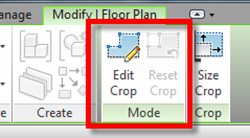
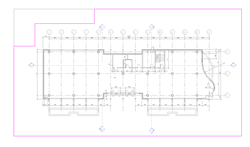
So non rectangular viewports have been on my Revit wish list for some time. In Revit 2014 we now have this added functionality for view crop regions and callouts. In essence the user can customise the shape of the crop region using Revit sketching tools.
Select the crop region, then choose the Edit Crop tool from the ribbon & sketch away. But before you get too excited, you are still only limited to rectangular shapes, no curves are arcs my friends. This feature will work on any crop region including plans, ceilings plans, elevations, sections, detail & section callout views.
Room Calculation Point
Once you have been using Revit for some time, you recognise that Revit needs to start to think a little smarter; it should know where things are. Whether you think software should be smart, is a debate for another day. But the introductory of a Room calculation point setting for family types which are room aware such as doors, furniture, casework, speciality equipment and generic models starts to help. This new function allows families which are placed in a project to know where they belong.

Schedules
Schedules; what would we do without schedules in Revit? They provide us with access to data in a way which was not possible using traditional CAD drafting approaches. I would suggest that anybody who is serious about building information modelling will know the power & possibilities that Revit scheduling functionality offers. Scheduling gives you access to data which you can utilise in many, many ways. We can capture integrated data; we can use schedules to input data. Neither the less, scheduling within Revit was not without its limitations, but Revit 2014 sees a major overhaul of the scheduling functionality. The interface for creating schedules in Revit remains the same, although new categories have been opened up, so we can now schedule architectural columns, detail items, entourage, generic models, grids, levels, pads, roof soffits, structural beam systems, structural area reinforcement, structural path reinforcement and structural fabric area.
Another nice minor enhancement is the ability to schedule phases created & demolished. However, more importantly we are provided with far more control over how we can format schedules. Text styles can be used to control the formatting of titles, headers and data within a schedule. Cells and text appearance can be overridden for cells in titles sections and columns. The Schedules are far more aligned with an Excel type appearance, so what you see is what you get, with more alliance between the schedule view & what you actually place on a sheet. You will find a new ribbon interface allows you to control the appearance of the schedule and if you understand the basics of Excel style column formatting, then this is going to be a total breeze for you to learn and implement.
Selection Enhancements
I believe one of the biggest challenges any new user has when starting to work with Revit is the way you select elements. Those that have been using Revit for some time, have learned to live & adapt to Revit element selection peculiarities. But I have seen countless occasions when Revit newbies select elements & screw things up. No fault of their own, it’s just a different process from what they are normally use to. Yet Revit does not make it easy during the transition process. To improve the way you can access & select elements, Revit 2014 has introduced a few improvements adding to what has always existed. There are now four selection options, which can be accessed via the modify tool or via the status bar. Each options has two states, either active or in-active. The options included Select Links, Select Underlay Elements, Select Elements by face, Drag elements on selection. With the select links function, if this behaviour is not enabled & you use the modify & move tools, this stops you accidentally selecting links or CAD linked files. Select underlay elements, again if this is not enabled, then you can’t select, modify or move underlayed elements.
Select elements by Face, now this is a biggie for me. With this feature enabled you can select a face of an element or by clicking at the edge. This now makes the whole process of editing, say a floor, a lot easier as you can select the face rather than having to grab a bunch of elements & filtering. If you don’t have this feature enabled, then it’s as it was before, you need to click on the edge of element or filter & select. Drag elements on Selection replaces what was press & drag. With the feature enabled, you hover over the element, press down the mouse & drag. Revit will then move the element. If this feature is not enabled. If you hover over a model elements, AC point, callout, grid, section, scope box or detail, pressing and dragging will result in the element NOT moving. It should also be noted that the settings are stored per user in the Revit.ini, so can be set as part of your deployment.
Split Elevations
Not sure this is noteworthy, but we have been able to do split sections for some time. But the functionality has been extended to elevations, allowing us to do split elevations. Now before you get over excited, it’s not what you think it is! It the same as the section tool, that’s it. What would have been very nice to see is the ability to unwrap elevations to create true elevation representations!
Temporary View Properties
Revit 2013 introduced some welcome improvements to view templates; the Temporary View Properties feature on 2014 takes this a little further. In the view control bar you are provided with access to Temporary View Properties. What this feature does is always you to change the view properties of a view without impacting the saved view state. The concept behind this is to potentially reduce the need for working views as you can quickly enable a Temporary View, apply the view template to better understand the impact of the view template without actually having to apply it. You can switch between different view templates which you have created & once you have finished, just select the reset feature to go back to the original state of the view. If you do enable the temp view, it has no bearing on the view for printing & also has no influence on the view when using worksharing.
Perceived Performance
If I had a pound or even a dollar for how many times I’ve heard users complain about how slow Revit is at times, I’d be a very rich man. The reality is, on some tasks Revit can be slow, but then if you consider what is happening under the hood, then maybe you might assess the situation differently. But then again, the reality is we want everything instantly! We want out email now! We want everything on tap, on demand & we no longer accept waiting. Over recent years we have seen multi-threading functionality introduced to some aspects of Revit. Speaking with the development team, it’s not a case of just flicking a few switches & tweaking the code to make Revit suddenly become a super multi-threaded wonder app. It’s a complex problem, due to the way Revit works. Saying that, one area which Revit certainly needed a kick was on screen redraws when zooming, panning & orbiting a model. So the Revit dev team have made some tweaks to improve graphic performance by automatically turning off graphic intensive effects during view navigation. This works in 2d & 3d. What actually happens is that the graphic effects are suspended during camera manipulation & then instantly redrawn to the screen once you finish the operation. It’s a little disconcerting at first, but once you get us to it you will value this improvement, Revit certainly feels quicker.
Multi- selection
A minor enhancement, but a vital one, is the proper implementation of the Bring to Front / Send Back ward tool. This now works as you would expect it. When you select multiple elements, be it detail elements or images you can reorder them correctly.
Stairs & Railings
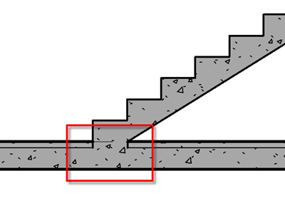
As this review is typically biased towards the architectural enhancements, we will look at these. With Revit 2013, we saw the introduction of the new component based stair as well as enhancements to the railings. Revit 2014 sees the component stairs developed even further with a few minor tweaks to the railings. The way a stair joins a floor or slab has been improved. Any precast stair can now be join to a floor or slab. You can now quash the additional riser created in a plan representation when a monolithic stair meets a landing.
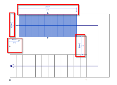
There have been developments made to the way you manipulate landings. Each landing, when selected, has controls to each edge which makes the process of editing the landing a lot easier. 
When you draw a stair, two additional location line options are provided. You now have exterior support left & exterior support right as well as actual run width settings. These can be set in the options bar when creating the stair.
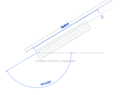
Autodesk put a lot of work into how stairs were represented with the component based stair. But as ever, things can always be improved. With 2014, the stair path arrow can now be displayed at top of landing. With the monolithic stair, the plan representation stair no longer displays an additional risers at half landings. The way snaps work with stairs also receives some enhancement. For example, we can now have a parallel snap, allowing us to reference other elements such as reference planes, walls, beams when you are creating straight stair runs. Another snap enhancement is the ability to parallel snap to riser lines when dragging the direct manipulation controls of a landing. All these snaps just provide a better fit / finish when working with the stair creation process.
One of the first things I noticed with component based stairs in Revit 2013, was the loss of temporary dimensions. Love or hate them, they are fundamental to the Revit modelling process in my humble opinion. Temporary dimensions are your best friend when making changes or tweaks to elements. With Revit 2014, Autodesk dev temp have listen to user feedback & component based stairs get temporary dimensions to control landing size, component position, stair width & radius of spiral stairs.
Sadly we haven’t seen any further enhancements to railings in 2014, but we do get some defects fixed, such as if end with riser is unchecked the railing will now be parallel with the stair run. Handrails would disappear in some views, this has been addressed.
Double Click to Edit
Maybe, I’m old school, but 2013 saw the introduction of double-click functionality to edit certain elements, after many user requests. But with any enhancements, sometimes there are trip hazards. Users who are rather trigger happy with double clicking, end up going down rabbit holes as they start editing something they didn’t mean to. But with care & precision, you learn to adjust. In line with functionality introduced into Vasari as well as Revit LT, we can now edit the following elements by double clicking.
| Element type | Double-click behaviour |
| Assemblies | Edit assembly mode |
| Schedules on Sheets | Open schedule view |
| Views on sheets | Activate view |
| Wall(EditProfile) | Edit profile |
| Floor(EditBoundary) | Edit boundary |
| Ceilings(EditBoundary) | Edit boundary |
| Roof (Footprint) | Edit boundary |
| Roof (Extrusion) | Edit boundary |
| Slab (Edit Boundary) | Edit boundary |
| Beam System (Edit Boundary) | Edit boundary |
| Railing | Edit railing |
| Stairs | Edit stairs |
| Edit Extrusion (Form) | Edit form |
| Edit Revolve (Form) | Edit form |
| Edit Sweep (Form) | Edit form |
| Edit Swept Blend (Form) | Edit form |
| Edit Blend (Default to edit Base) | Edit base |
| Truss (Edit Profile) | Edit profile |
| Rebar | Edit rebar |
| Reinforcement | Edit rebar |
| Opening Cut | Edit sketch |
| Filled Region | Edit sketch |
| Revision Cloud | Edit sketch |
| Split Face element | Edit sketch |
So to protect those that may be a bit too hasty when using the double click functionality; in the options, the user can now customise the double click settings.
One other minor, but useful tweak is when editing a parameter in a tag, a parameter takes priority when you double click on a parameter label.
Point Clouds
Laser scanning & data capture is now common place to the BIM process. There are plenty of surveying firms & even contractors using laser scanning equipment, as the cost of ownership has reduced, to capture large quantities of data about buildings as point clouds. This data, albeit it huge in size, is being used for modelling of existing conditions as well as cross referencing the Building Information Model (design intent) against what is built on site. Revit has had the ability to link in point clouds for some time, but Revit 2014 sees the implementation of a completely new engine.
What this is, is the inclusion of the Alice labs acquisition within Revit. What I have tested is astonishingly fast, throwing a 5 gig cloud data file around in Revit was amazingly smooth. Linking the point cloud into a Revit project is exactly the same, but there are more point cloud file types available. You do need to index the point cloud data structure for the engine before loading it in. If you select a raw dataset to be inserted into Revit, you will be asked to index the data. Once indexed the resulting RCS file can be linked into a Revit project. Crop regions & sections box tools allow you to control the visibility of the point cloud. But with visibility graphics you can also override the colour mode of the point cloud.
There are 5 options available for colour modes of the point cloud.
<No Override>: This will display the point cloud in the colours specified in the source file, if they are available.
Single Color: will displays all points in the point cloud in a single colour that you can specify.
Elevation: will display the points in the point cloud using a gradation of colour between the 2 colours (Max Elevation and Min Elevation) that you can specify.
Intensity: displays the points in the point cloud using a gradation of colour between 2 colours (Max Intensity and Min Intensity) that you can specify.
Normals: displays the points in colours relative to the direction of the point normal (the direction of reflectance of points when initially captured). For example, all points with a normal direction "up" will have a consistent colour.
You can still snap to planes detected within the point cloud when using snap functionality, but we still have some way to go before we can start to automatically convert point cloud data into smart objects. This will come, but for now just being to reference reality into a BIM environment starts to close yet another gap in the BIM process.
Some of the other paraphernalia
So included below are few other enhancements which are worth knowing about. Not earth shattering, but they all go a long way to the fit & finish process of existing functionality.
When you divide a surface in the conceptual massing environment, you can adjust the u/v angle with the align tool. You can specify a default divisions to surface settings, which will be retained in the project for subsequent uses of the divide surface tool.
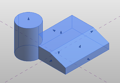
This one I am genuinely excited by. When you import a solid into a family, you have the ability to fully explode the solid. What this actually does is turn this into an element which you can actually do something with! Whilst you can’t actually edit the form, you can manipulate the resulting freeform elements with direct manipulation handles. You can also cut, join the geometry with form functionality tools. Now all we need is Revit to be able to read parameters from other tools!
When working in the conceptual massing environment, you can use a 3d start – end – radius Arc, which creates a 3d arc. The points of the arc can be hosted on reference geometry.
To solve a particular COBie requirement, you can allow parameters to vary between groups. You can control values so they are aligned per group type or values can vary by group instance.
There are a raft of minor tweaks to interoperability. Substantial work has taken place to ensure IFC export gets IFC certification in accordance with buildingSMART international standards requirements. DWF files now support textures, line patterns, lineweights, colours as well as sun paths. DWG / DXF export sees further improvements to how Revit dimensions export to AutoCAD. When a DWG or DXF file is linked into Revits project environment, import / links only list the views the imported / linked file appears in via the visibility graphics dialogue box. If you delete a view with a linked DWG file you can now re-establish a new reference view, rather than having to remove the linked DWG file & then re-link it in.
One other minor, yet critical improvement is the ability to control dual units in dimensions. Any dimension can display both units say metric & imperial. Just by simply going to the dimension style & enabling Alternate Units, then picking the Alternative Units Format you can display two different dimension formats in a dimension string.
Summary
So here endeth this year’s round up / sermon of new Revit functionality for the release of 2014. What do I think? Good…..actually very good. I’m not just saying that; there is some honest improvements to aging functionality which needed to be modernized as well as bundle of items which I would refer to fit & finish functionality. Sometimes you need that, so you can take stock and improve the whole user experience. I really like the displaced views tool, that’s a cracking enhancement in my opinion & schedule functionality update is very much welcomed. Alignment with how Excel works & functions, is very nice. Revit 2014 feels snappier and smoother in operation. But…. there is always a “but”…..I want to see developments to site tools, nothing as dynamic as say Civil3d, just the ability to model proper roads, pavements & terrain. We need better ways to create & control railings & custom railings. I never thought I would say this, but text formatting! Autodesk, just do it. We talk up BIM, with plenty that are developing models, yet deliverables still remain 2d. Disagree with me if you like, but right now 2d information is not going to disappear anytime soon. Improving how we link in notes & formatting of text is something we just need to enhance to improve the overall completion of the tool. Working in perspective views, can it be that difficult? Those kids over at Vasari team have cracked it. Non-photo realistic enhancements, squiggled line presentation views. More graphics card GPU enhancements & finally its time curtain walls got an injection of love. I don’t want much do I?
Music listen to when formulating this review - Above & Beyond anjunabeats vol. 10









Không có nhận xét nào:
Đăng nhận xét